First impressions are crucial. If your “above the fold” website content doesn’t grab your visitors’ attention the second they land on your site, they won’t bother to stick around any longer. But if you get their attention, and they’ll stick around, subscribe, and buy.
But wait – what the heck is a “fold” in web design anyway, and why is it so important?
If that’s what you’re thinking when you hear the term “above the fold content”, you’re not the only one.
That’s because the idea of the fold goes back to the days before digital. Most newspapers were sold from sidewalk kiosks, as some still are today. They were usually folded in half so passersby could see the top half of the front page. If what they saw didn’t grab them, they’d keep on walking, and sales would be down. That’s why it was crucial to put your best, most interesting content “above the fold”.
The concept of the fold is pretty useful for websites, too. When you’re talking about above-the-fold in web design, it’s simply the content that fills your screen. The “fold” is the bottom of the screen.
That’s why it’s crucial to hook visitors from the minute they land on your site. Get their attention, and they’ll stay and convert.
To help you get your visitors scrolling down, we’ve collected some great examples of above the fold content you can use for inspiration.
Let’s get started …
What Is Above the Fold?
‘Above the Fold’ refers to the portion of a webpage visible without scrolling. Originating from the newspaper industry, where the most important stories were placed above the physical fold of the paper, this concept has evolved significantly in the context of web design.
The Evolution of ‘Above the Fold’ in Web Design
From Newspapers to Digital Screens
The transition from print to digital has been revolutionary. In the early days of the internet, ‘Above the Fold’ was a straightforward concept, largely influenced by the standard desktop screen sizes. However, with the advent of diverse devices, this concept has become more complex and nuanced.
Adapting to Changing Screen Sizes
Today, ‘Above the Fold’ content must cater to a variety of screen sizes, from large desktop monitors to compact smartphones. This evolution has made responsive design an indispensable part of web development.
Why ‘Above the Fold’ Matters for Online Businesses?
First Impressions Count
Remember, you never get a second chance to make a first impression. The content that appears ‘Above the Fold’ is your digital storefront. It’s what hooks your audience or sends them away. For instance, when I revamped my website’s ‘Above the Fold’ area, I noticed a 30% decrease in bounce rate within the first month.
Impact on User Engagement
Engaging ‘Above the Fold’ content is crucial for keeping visitors on your site. It’s not just about aesthetics; it’s about creating an immediate connection with your audience.
Key Elements of Effective ‘Above the Fold’ Content
Crafting Compelling Headlines
Your headline is the first thing visitors see. Make it count. It should be clear, engaging, and reflective of your brand’s voice.
Utilizing High-Quality Visuals
Humans are visual creatures. High-quality images or videos can convey your message quickly and effectively. Remember, these visuals should be optimized for fast loading.
Clear Calls to Action
Your CTA should be prominent and persuasive. It guides users on what to do next, whether it’s subscribing to a newsletter or checking out a product.
Embracing Responsive Design: Responsive design ensures your ‘Above the Fold’ content looks great on any device. This isn’t just about aesthetics; it’s about functionality and accessibility.
Testing and Optimization: Always test your designs across different devices. Tools like Google’s Mobile-Friendly Test can be invaluable for this.
Balancing Design and SEO: While ‘Above the Fold’ is crucial for user experience, it also impacts SEO. Google values user experience, and a well-designed ‘Above the Fold’ area can contribute to better search rankings.
Measuring Effectiveness
Analytics are Key
Use tools like Google Analytics to understand how users interact with your ‘Above the Fold’ content. Look at metrics like time on page and bounce rate to gauge effectiveness.
1. HubSpot
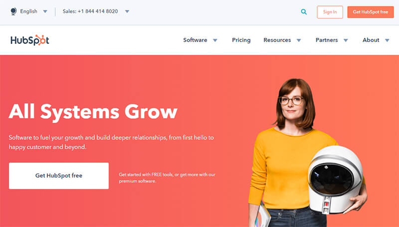
HubSpot is all about growth, and that’s exactly what its above the fold design shows. The image suggests learning (notebook) and advanced technology (space helmet).
The headline is a play on the common phrase “all systems go”, suggesting that the reader will be forging ahead with growth. That idea’s reinforced in the subhead. Then there’s a compelling offer of free software on the CTA button.
2. Jeff Bullas
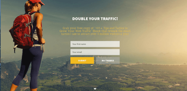
Jeff Bullas has two sets of above the fold content. When you first land on his site he has a welcome gate, with a compelling offer to get his tips on doubling traffic. The large background image attracts readers’ attention immediately.
Click on the arrow, at the end of the welcome gate, and it takes you to his main page, where there’s social proof of his readership and online authority. You still have to scroll once to get to the content, but by then most readers are likely convinced.
3. SnackNation
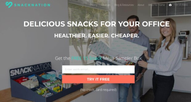
SnackNation‘s above the fold content shows exactly what’s on offer, with a background image of a person with a snack sampler box in an office. The content offers visitors the chance to sign up for their own sampler box. This is a great way to get business leads. In fact, thanks to OptinMonster, SnackNation gets 1200 new leads each week with this above the fold design.
4. Missinglettr
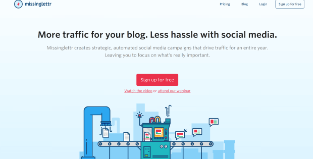
Missinglettr‘s homepage also works because the headline gets right to the point of what its visitors want: a hassle-free way to drive social traffic with their content.
The two-sentence explanation gives more detail on the product, then there’s a visible CTA below. The page also includes two other CTAs targeted to those who might not yet be ready to sign up.
Having three actions to take instead of just one might make them less effective, but we’re willing to bet this design is based on rigorous split testing, so the company knows it works for their audience.
5. OptimizeMyAirBnB
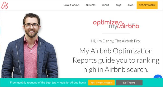
Optimize My AirBnB takes a more personable approach to its above the fold website design. There’s a big picture of the site owner who appears to be looking directly at the reader, thus drawing their gaze.
To the right of the page, there’s a welcome sentence which outlines the key benefit of the site. And by the time you’ve read that, there’s an OptinMonster floating bar offering you the chance to sign up for more tips and tools. This was one factor in growing the site’s list 650%.
6. Content Marketing Institute
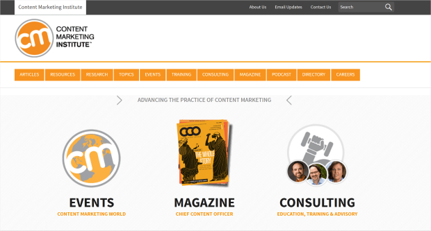
The Content Marketing Institute (CMI) takes a slightly different tack with its above the fold content. At the top, there’s a menu listing all the different types of content they offer.
But the bulk of the page is taken up with the products they most want to promote: their events, consulting services and magazine. Everything is in the brand colors, creating a harmonious visual experience.
7. MonsterInsights
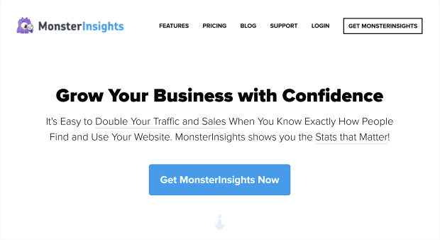
MonsterInsights keeps it simple with a white background. Against this, the headline stands out well, and the subheadline subtly underlines two key benefits for readers. There’s also a clear and visible call to action, with a subtle arrow inviting readers to scroll down if they still want more info. In the case of this above the fold design, minimalism works!
8. The Guardian
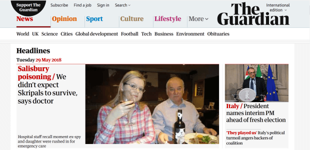
As you’d expect from an online newspaper, The Guardian nails above the fold content. In this example, two stories stand out. The one on the left has a bigger headline and picture to draw the eye.
But the online publication is taking no chances; there’s another story just in case the main one doesn’t grab readers. The story category is in red, contrasting with the black of the headline, to create a compelling visual effect.
9. Guido’s
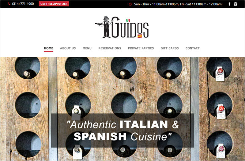
The most effective aspect of Guido’s above the fold content isn’t the statement about its authentic cuisine. And it isn’t the compelling image of the wine rack with labeled bottles sticking out of it.
It’s actually the menu button that says “Get free appetizer”. That button triggers an OptinMonster MonsterLink , which got the restaurant more than 1000 new leads in four months.
Here’s how you can add a popup to your website menu, too.
10. OutreachPlus
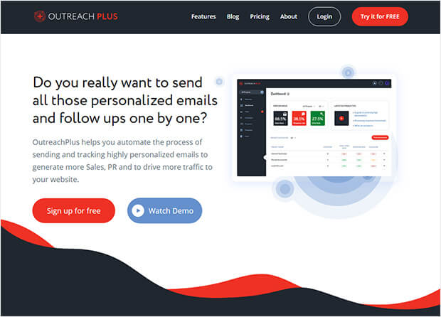
OutreachPlus grabs readers’ attention with a question that makes them think. Then it shows how the product could help solve that problem. The homepage is simple. Apart from the headlines, there’s a screenshot of the product, plus two choices of what to do next: buy, or learn more by viewing a demo.
11. Search Engine Journal
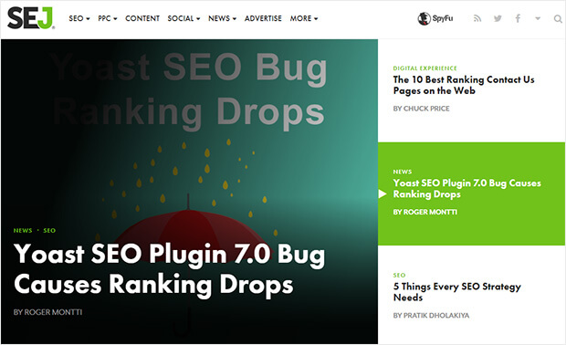
Search Engine Journal is a content site, so its above-the-fold design puts their content in the spotlight. The site’s design lets them showcase three stories above the fold. There’s also a clever bit of web design here. The three stories are listed on the right of the page. Each is highlighted in green in turn. When a story’s highlighted, it takes the top spot on the left of the page, displaying with an attention-grabbing image and headline.
12. ConversionXL
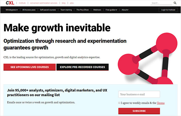
You’d expect Peep Laja’s ConversionXL to get above the fold content right. It’s another simple design. This page has an in your face headline, and a subheadline that states their core belief. There are also two CTA buttons giving choices for what to do next, and a secondary CTA below that to sign up for their email newsletter.
13. Christmas Lite Show
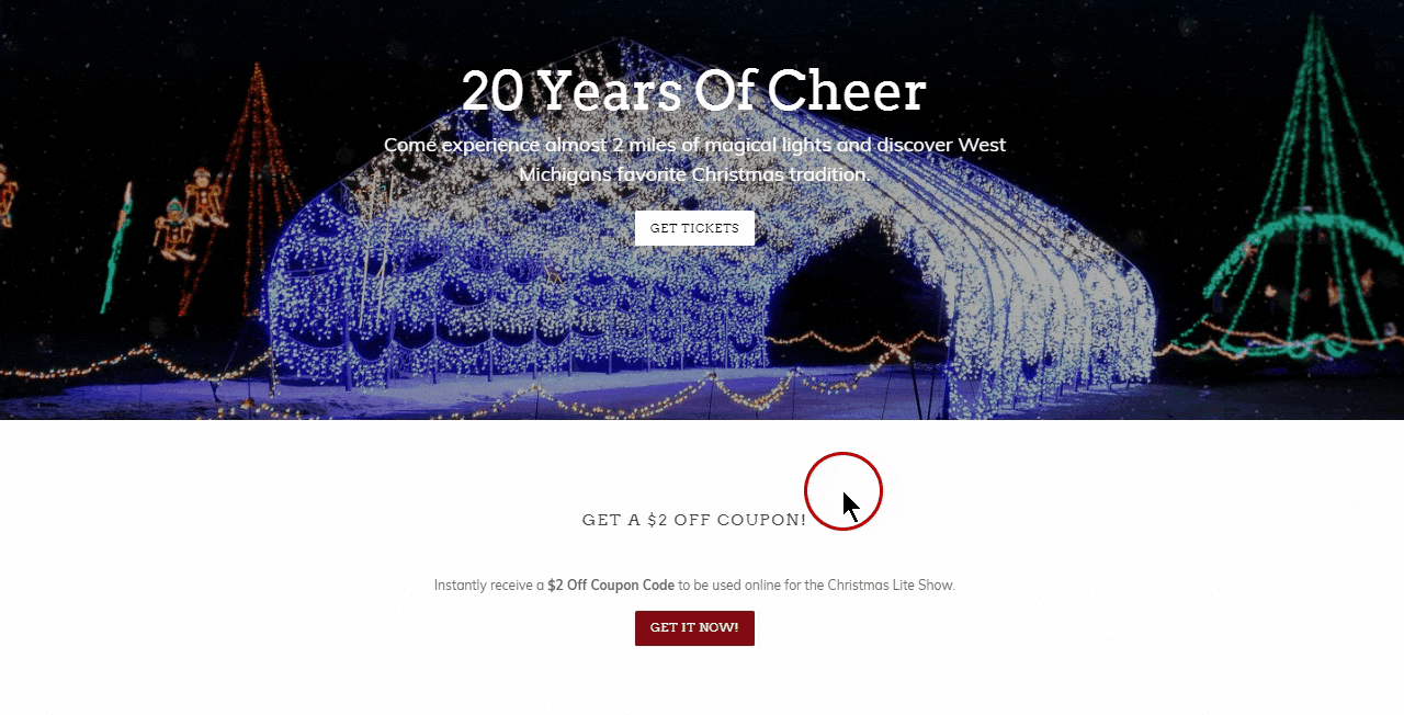
Christmas Lite Show converted 30% of visitors simply by triggering an OptinMonster MonsterLink in its above the fold content. The button launched a countdown popup with a coupon offer. The combo converted 30% of visitors and added 7,000 new subscribers to the company’s email list.
14. Problogger
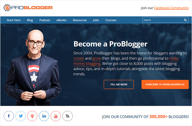
Problogger is another content heavy site, so its above the fold content focuses on making it easy for people to find the information they want. At the top, there’s a comprehensive navigation menu. There’s an image of founder Darren Rowse to create a personal connection with the visitor, plus a 2-step optin that triggers an email signup form popup.
15. Kennedy Blue
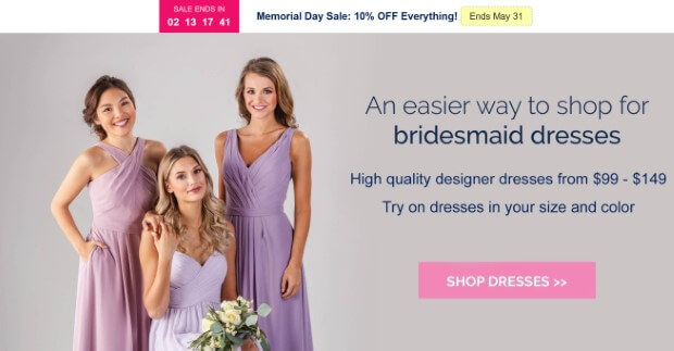
Kennedy Blue is a great example of above the fold online content. The main banner includes an image of three women in different styles of bridesmaid dresses.
Meanwhile the copy highlights how easy it is to shop for dresses, and gives a price range. The CTA sends visitors straight to the shop. And the site’s using an OptinMonster floating bar to highlight the current sale – just one of the ways they were able to achieve a 50% increase in sales.
16. Copyblogger
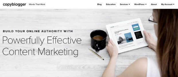
Copyblogger‘s above the fold content is minimalist. Most of the space is taken up by an image showing a person looking at a piece of Copyblogger content. Since she’s facing left, her gaze draws the visitor’s attention to the headline. The headline shows the benefit (building online authority) with the offer (effective marketing).
17. Bluehost
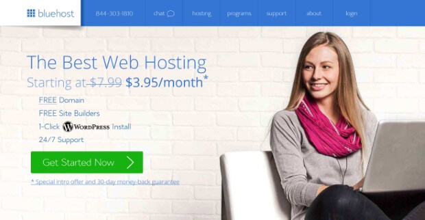
On its homepage, Bluehost uses an image on the right with the person’s eyes looking towards the text on the left. This is a clever bit of psychology that directs readers’ eyes there, too.
When they look, they see a headline, a reduced price (which is always appealing) and a short list of key benefits. Underneath is a visible CTA button urging readers to get started.
That’s it! Now you’ve seen some above the fold web examples that really work, apply these principles to get your visitors on board.
Want to learn how to use custom fonts on your optin campaigns? Learn how to upload custom fonts to your OptinMonster campaigns.
Next, check out our guides to email marketing and growth hacking your business. And don’t forget to follow us on Facebook and Twitter to keep track of all our new content.
The post 17 Stunning Examples of Above the Fold Content to Hook Your Visitors appeared first on OptinMonster.
Comments
Post a Comment